A toolbox for rendering risk literacy more transparent
Risk-related information — like the prevalence of conditions, the sensitivity and specificity of diagnostic tests, or the effectiveness of interventions or treatments — can be expressed in terms of frequencies or probabilities. By providing a toolbox of corresponding metrics and representations, riskyr computes, translates, and visualizes risk-related information in a variety of ways. Adopting multiple complementary perspectives provides insights into the interplay between key parameters and renders teaching and training programs on risk literacy more transparent (see Neth et al., 2021, for details).
Motivation
Solving a problem simply means representing it
so as to make the solution transparent. (H.A. Simon)1
The goals of riskyr are less of a computational and more of a representational nature: We express risk-related information in multiple formats, facilitate the translation between them, and provide a variety of attractive visualizations that emphasize different aspects of risk-related scenarios (see Neth et al., 2021, for theoretical details). Whereas people find it difficult to understand and compute information expressed in terms of probabilities, the same information is easier to understand and compute when expressed in terms of frequencies (e.g., Gigerenzer, 2002, 2014; Gigerenzer & Hoffrage, 1995). But rather than just expressing probabilities in terms of frequencies, riskyr allows translating between formats and illustrates the relationships between different representations in a variety of ways. Switching between and interacting with different representations fosters transparency and boosts human understanding of risk-related information.2
The basic assumptions and aspirations driving the current development of riskyr include:
Effective training in risk literacy requires transparent representations, smart strategies, and simple tools.
We aim to provide a set of (computational and representational) functions that facilitate various calculations, translations between formats, and enable a range of alternative views on the interplay between probabilities and frequencies.
Just as no single tool fits all tasks, no single graph illustrates all aspects of a problem. A variety of visualizations that illustrate the interplay of parameters and metrics can facilitate active and explorative learning. It is particularly helpful to view relationships from alternative perspectives and to observe the change of one parameter as a function of others.
Based on these assumptions and goals, riskyr provides a range of computational and representational tools. Importantly, the objects and functions in the riskyr toolbox are not isolated, but complement, explain, and support each other. All functions and visualizations can be used separately or explored interactively, providing immediate feedback on the effect of changes in parameter values. By providing a variety of customization options, users can explore and design representations of risk-related information that fit to different tasks and meet their personal needs and goals.
Getting riskyr
Installation
The current release of riskyr is available from CRAN at https://CRAN.R-project.org/package=riskyr:
install.packages('riskyr')  # install riskyr from CRAN client
library('riskyr')           # load to use the package
The current development version can be installed from its GitHub repository at https://github.com/hneth/riskyr/:
# install.packages('devtools')
devtools::install_github('hneth/riskyr')
Available resources
An interactive online version is available at https://riskyr.org/.
-
The package documentation is available online:
- current release version: https://hneth.github.io/riskyr/
- current development version: https://hneth.github.io/riskyr/dev/
Quick start guide
Defining a scenario
riskyr is designed to address problems like the following:3
Screening for hustosis
A screening device for detecting the clinical condition of hustosis is developed. The current device is very good, but not perfect. We have the following information:
1. About 4% of the people of the general population suffer from hustosis.
2. If someone suffers from hustosis, there is a chance of 80% that he or she will test positively for the condition.
3. If someone is free from hustosis, there is a chance of 5% that he or she will still test positively for the condition.Mr. and Ms. Smith have both been screened with the device:
- Mr. Smith tested positively (i.e., received a diagnosis of hustosis).
- Ms. Smith tested negatively (i.e., was judged to be free of hustosis).Please answer the following questions:
- What is the probability that Mr. Smith actually suffers from hustosis?
- What is the probability that Ms. Smith is actually free of hustosis?
Probabilities provided
The first challenge in solving such problems is in understanding the information that is being provided. The problem description provides three essential probabilities:
- The condition’s prevalence (in the general population) is 4%:
prev = .04.
- The device’s or diagnostic decision’s sensitivity is 80%:
sens = .80.
- The device’s or diagnostic decision’s false alarm rate is 5%:
fart = .05, implying a specificity of (100% 5%) = 95%:spec = .95.
Understanding the questions asked
The second challenge here lies in understanding the questions that are being asked — and in realizing that their answers are not simply the decision’s sensitivity or specificity values. Instead, we are asked to provide two conditional probabilities:
- The conditional probability of suffering from the condition given a positive test result,
aka. the positive predictive value (PPV). - The conditional probability of being free of the condition given a negative test result,
aka. the negative predictive value (NPV).
Translating into frequencies
One of the best tricks in risk literacy education is to translate probabilistic information into frequencies.4 To do this, we imagine a representative sample of N = 1000 individuals. Rather than asking about the probabilities for Mr. and Ms. Smith, we could re-frame the questions as:
Assuming a representative sample of 1000 individuals:
- What proportion of individuals with a positive test result actually suffer from hustosis?
- What proportion of individuals with a negative test result are actually free of hustosis?
Creating a scenario from probabilities
We define a new riskyr scenario (called hustosis) by using the riskyr() function and entering the information provided by our problem as its arguments:
hustosis <- riskyr(scen_lbl = "Example",
                   cond_lbl = "Hustosis",
                   dec_lbl = "Screening",
                   popu_lbl = "Sample",
                   N = 1000,  # population size
                   prev = .04, sens = .80, spec = (1 - .05)  # 3 probabilities
                   )
By providing the argument N = 1000 we define the scenario for a target population of 1000 people. If we leave this parameter unspecified (or NA), the riskyr() function will automatically pick a suitable value of N.
Summary
To obtain a quick overview of key parameter values, we ask for the summary of hustosis:
summary(hustosis) # summarizes key parameter values: The summary distinguishes between probabilities, frequencies, and accuracy information. In Probabilities we find the answer to both of our questions that take into account all the information provided above:
The conditional probability that Mr. Smith actually suffers from hustosis given his positive test result is 40% (as
PPV = 0.400).The conditional probability that Ms. Smith is actually free of hustosis given her negative test result is 99.1% (as
NPV = 0.991).
If find these answers surprising, you are an ideal candidate for additional insights into the realm of risk literacy. A key component of riskyr is to analyze and view a scenario from a variety of different perspectives. To get you started immediately, we only illustrate some introductory commands here and focus on different types of visualizations. (Call riskyr.guide() for various vignettes that provide more detailed information.)
Creating a scenario from frequencies
Rather than defining our hustosis scenario by providing 3 essential probabilities (prev, sens, and spec), we could define the same scenario by providing 4 essential frequencies (hi, mi, fa, and cr) as follows:
hustosis_2 <- riskyr(scen_lbl = "Example",
                     cond_lbl = "Hustosis",
                     dec_lbl = "Screening",
                     popu_lbl = "Sample",
                     hi = 32, mi = 8, fa = 48, cr = 912  # 4 key frequencies
                     )
As we took the values of these frequencies from the summary of hustosis, the hustosis_2 scenario should contain exactly the same information as hustosis:
all.equal(hustosis, hustosis_2)  # do both contain the same information?
#> [1] TRUE
Visualizations
Various visualizations of riskyr scenarios can be created by a range of plotting functions.
Prism plot
The default type of plot used in riskyr is a prism plot (or network diagram) that shows key frequencies of a scenario as nodes and key probabilities as edges linking the nodes:
plot(hustosis)  # default plot

# => internally calls plot_prism(...) with many additional arguments:
# plot(hustosis, type = "prism", by = "cddc", area = "no", f_lbl = "num", p_lbl = "mix")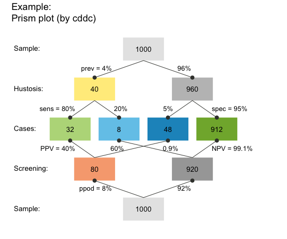
Tree diagram
A tree diagram is the upper half of a prism plot, which can be obtained by plotting a scenario with 1 of 3 perspectives:
- by condition (
by = "cd"), to split the population into TRUE vs. FALSE (cond_truevs.cond_false) cases; - by decision (
by = "dc"), to split the population into negative vs. positive (dec_negvs.dec_pos) decisions; - by accuracy (
by = "ac"), to split the population into correct vs. incorrect (dec_corvs.dec_err) decisions.
For instance, the following command plots a frequency tree by decisions:
plot(hustosis, by = "dc") # plot a tree diagram (by decision)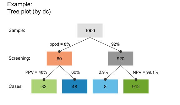
This particular tree splits the population of N = 1000 individuals into two subgroups by decision (by = "dc") and contains the answer to the second (frequency) version of our questions:
- The proportion of individuals with a positive test result who actually suffer from hustosis is the frequency of “true positive” cases (shown in darker green) divided by “decision positive” cases (shown in purple):
32/80 = .400(corresponding to our value ofPPVabove).
- The proportion of individuals with a negative test result who are actually free from hustosis is the frequency of “true negative” cases (shown in lighter green) divided by “decision negative” cases (shown in blue):
912/920 = .991(corresponding to our value ofNPVabove, except for minimal differences due to rounding).
Of course, the frequencies of these ratios were already contained in the hustosis summary above. But the representation in the form of a tree diagram makes it easier to understand the decomposition of the population into subgroups and to see which frequencies are required to answer a particular question.
Frequency net
A new type of visualization combines elements from 2x2 tables with those of tree or double tree diagrams. The frequency net (Binder et al., 2020) is similar to a 2x2 table insofar as its perspectives (shown by arranging marginal frequencies in a vertical vs. horizontal fashion) do not suggest an order or dependency (in contrast to trees or mosaic plots). Additionally, the frequency net allows showing 3 kinds of (marginal, conditional, and joint) probabilities:
plot(hustosis, type = "fnet", by = "cddc",
     f_lbl = "namnum")  # plot frequency net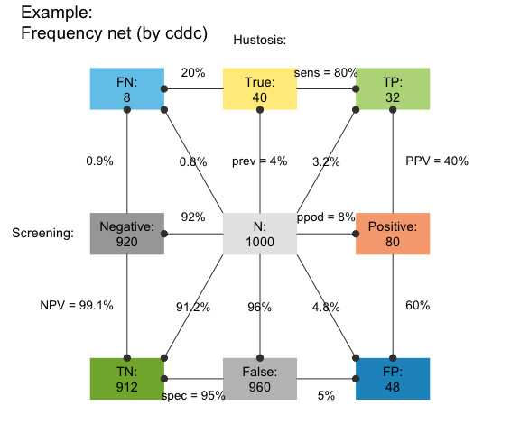
See the plot_fnet() function for options and details.
Icon array
An icon array shows the classification result for each of N = 1000 individuals in our population:
plot(hustosis, type = "icons") # plot an icon array While this particular icon array is highly regular (as both the icons and classification types are ordered), riskyr provides many different versions of this type of graph. This allows viewing the probability of diagnostic outcomes as either frequency, area, or density (see ?plot_icons for details and examples).
Area plot
An area plot (or mosaic plot) offers a way of expressing classification results as the relationship between areas. Here, the entire population is represented as a square and the probability of its subgroups as the size of rectangles (see ?plot_area for details and examples):
plot(hustosis, type = "area") # plot an area/mosaic plot (by = "cddc")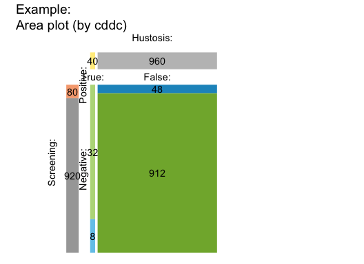
Table plot
When not scaling the size of rectangles by their relative frequencies or probabilities, we can plot basic scenario information as a 2-by-2 confusion (or contingency) table (see ?plot_tab for details and examples):
plot(hustosis, type = "table") # plot 2x2 confusion table (by = "cddc") 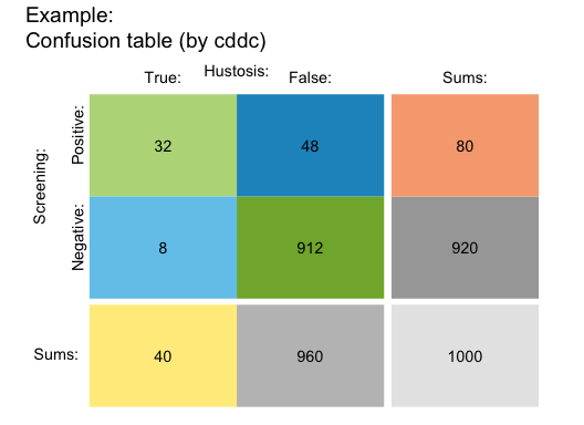
Bar plot
A bar plot allows comparing relative frequencies as the heights of bars (see ?plot_bar for details and examples):
plot(hustosis, type = "bar", f_lbl = "abb") # plot bar chart (by "all" perspectives): 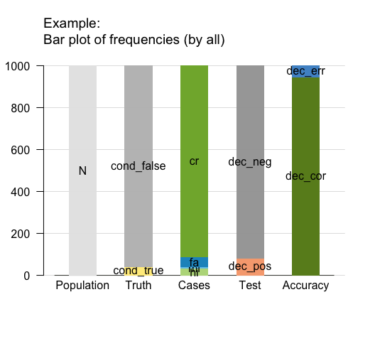
Curves
By adopting a functional perspective, we can ask how the values of some probabilities (e.g., the predictive values PPV and NPV) change as a function of another (e.g., the condition’s prevalence prev, see ?plot_curve for details and examples):
plot(hustosis, type = "curve", uc = .05) # plot probability curves (by prevalence):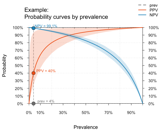
Planes
When parameter values systematically depend on two other parameters, we can plot this as a plane in a 3D cube. The following graph plots the PPV as a function of the sensitivity (sens) and specificity (spec) of our test for a given prevalence (prev, see ?plot_plane for details and examples):
plot(hustosis, type = "plane") # plot probability plane (by sens x spec):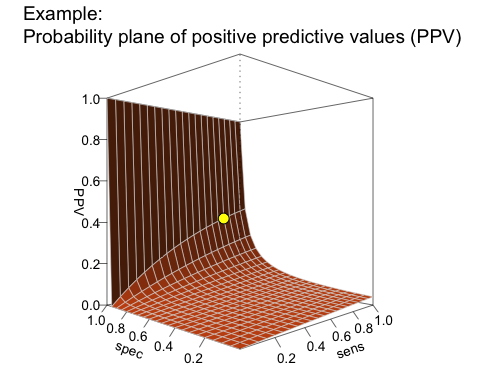
The L-shape of this plane reveals a real problem with our current test: Given a prevalence of 4% for hustosis in our target population, the PPV remains very low for the majority of the possible range of sensitivity and specificity values. To achieve a high PPV, the key requirement for our test is an extremely high specificity. Although our current specificity value of 95% (spec = .95) may sound pretty good, it is still not high enough to yield a PPV beyond 40%.
Using existing scenarios
As defining your own scenarios can be cumbersome and the literature is full of risk-related problems (often referred to as “Bayesian reasoning”), riskyr provides a set of — currently 24 — pre-defined scenarios (stored in a list scenarios). Here, we provide an example that shows how you can select and explore them.
Selecting a scenario
Let us assume you want to learn more about the controversy surrounding screening procedures of prostate-cancer (known as PSA screening). Scenario 10 in our collection of scenarios is from an article on this topic (Arkes & Gaissmaier, 2012). To select a particular scenario, simply assign it to an R object. For instance, we can assign Scenario 10 to s10:
s10 <- scenarios$n10 # assign pre-defined Scenario 10 to s10Scenario summary
Our selected scenario object s10 is a list with 30 elements, which describe it in both text and numeric variables. The following commands provide an overview of s10 in text form:
s10$scen_lbl   # a descriptive label
s10$cond_lbl   # the current condition
s10$dec_lbl    # the current decision
s10$popu_lbl   # the current population

# summary(s10) # summarizes a scenario
Generating some riskyr plots allows a quick visual exploration of the scenario. We only illustrate some selected plots and options here, and trust that you will play with and explore the rest for yourself.
Prism plots
A tree diagram is a prism plot that views the population from only one perspective, but provides a quick overview. In the following plot, the boxes are depicted as squares with area sizes that are scaled by relative frequencies (using the area = "sq" argument):
plot(s10, type = "tree", by = "cd", area = "sq",  # tree/prism plot with scaled squares
f_lbl = "def", f_lbl_sep = ":\n") # custom frequency labels 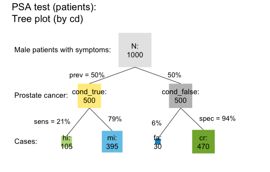
The prism plot (or network diagram) combines 2 tree diagrams to simultaneously provide two perspectives on a population (see Wassner et al., 2004). riskyr provides several variants of prism plots. To avoid redundancy to the previous tree diagram, the following version splits the population by accuracy and by decision (see the by = "acdc" argument). In addition, the frequencies are represented as horizontal rectangles (area = "hr") so that their relative width reflect the number of people in the corresponding subgroup:
plot(s10, type = "prism", by = "acdc", area = "hr",  # prism plot with horizontal rectangles
     p_lbl = "num")                                  # numeric probability labels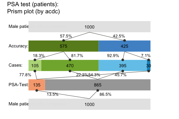
Frequency net
Just like the 2x2 table, area plot, and prism plot, the frequency net allows selecting two out of three perspectives. Additionally, the shape and size of the frequency boxes can be adjusted by using the area = "sq" option. The following example shows a frequency net by condition and accuracy (by = "cdac") without the joint probabilities, with custom settings for labels, links, and colors:
plot(s10, type = "fnet", by = "cdac",  # frequency net (by condition and accuracy)
     area = "sq", joint_p = FALSE, arr_c = 2,     # custom areas, links, and arrows
f_lbl = "namnum", p_lbl = "num", col_pal = pal_rgb) # custom labels and colors 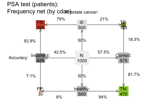
Icon array
plot(s10, type = "icons", arr_type = "shuffled") # plot a shuffled icon array Area plot
plot(s10, type = "area", p_split = "v", p_lbl = "def") # plot an area/mosaic plot (with probabilities) Table plot
plot(s10, type = "tab", p_split = "h", p_lbl = "def") # plot a 2x2 table (with probabilities)Curves
The following curves show the values of several conditional probabilities as a function of prevalence:
plot(s10, type = "curve", what = "all", uc = .05) # plot all curves (by prev):Adding the argument what = "all" also shows the proportion of positive decisions (ppod) and the decision’s overall accuracy (accu) as a function of the prevalence (prev). Would you have predicted their shape without seeing this graph?
Planes
The following surface shows the negative predictive value (NPV) as a function of sensitivity and specificity (for a given prevalence):
plot(s10, type = "plane", what = "NPV") # plot plane (as a function of sens x spec):Hopefully, this brief overview managed to whet your appetite for visual exploration. If so, call riskyr.guide() for viewing the package vignettes and obtaining additional information.
About
![]()
riskyr originated out of a series of lectures and workshops on risk literacy.
The current version (0.5.0, as of Sep 15, 2025) is under active development. Its primary designers are Hansjörg Neth, Felix Gaisbauer, Nico Gradwohl, and Wolfgang Gaissmaier, who are researchers at the department of Social Psychology and Decision Sciences at the University of Konstanz, Germany.
The riskyr package is open source software written in R and released under the GPL 2 | GPL 3 licenses.
The theoretical background of riskyr is illuminated further in the following article:
- Neth, H., Gradwohl, N., Streeb, D., Keim, D.A., & Gaissmaier, W. (2021). Perspectives on the 2x2 matrix: Solving semantically distinct problems based on a shared structure of binary contingencies. Frontiers in Psychology: Cognition, 11, 567817. doi: 10.3389/fpsyg.2020.567817
Resources
The following resources and versions are currently available:
| Type: | Version: | URL: |
|---|---|---|
| A. riskyr (R package): | Release version | https://CRAN.R-project.org/package=riskyr |
| Development version | https://github.com/hneth/riskyr/ | |
| B. riskyrApp (R Shiny code): | Online version | https://riskyr.org/ |
| Development version | https://github.com/hneth/riskyrApp/ | |
| C. Online documentation: | Release version | https://hneth.github.io/riskyr/ |
| Development version | https://hneth.github.io/riskyr/dev/ |
Contact
We appreciate your feedback, comments, or questions.
Please report any riskyr-related issues at https://github.com/hneth/riskyr/issues/.
Contact us at contact.riskyr@gmail.com with any comments, questions, or suggestions.
Reference
![]()
To cite riskyr in derivations and publications, please use:
- Neth, H., Gaisbauer, F., Gradwohl, N., & Gaissmaier, W. (2025).
riskyr: Rendering Risk Literacy more Transparent.
Social Psychology and Decision Sciences, University of Konstanz, Germany.
Computer software (R package version 0.5.0, Sep 15, 2025).
Retrieved from https://CRAN.R-project.org/package=riskyr.
doi 10.32614/CRAN.package.riskyr
A BibTeX entry for LaTeX users is:
@Manual{riskyr,
  title = {riskyr: Rendering Risk Literacy more Transparent},
  author = {Hansjörg Neth and Felix Gaisbauer and Nico Gradwohl and Wolfgang Gaissmaier},
  year = {2025},
  organization = {Social Psychology and Decision Sciences, University of Konstanz},
  address = {Konstanz, Germany},
  note = {R package (version 0.5.0, Sep 15, 2025)},
  url = {https://CRAN.R-project.org/package=riskyr},
  doi = {10.32614/CRAN.package.riskyr}
  }
Calling citation("riskyr") in the package also provides this information.
References
Arkes, H. R., & Gaissmaier, W. (2012). Psychological research and the prostate-cancer screening controversy. Psychological Science, 23, 547–553.
Binder, K., Krauss, S., and Wiesner, P. (2020). A new visualization for probabilistic situations containing two binary events: The frequency net. Frontiers in Psychology, 11, 750. doi: 10.3389/fpsyg.2020.00750
Garcia-Retamero, R., & Cokely, E. T. (2017). Designing visual aids that promote risk literacy: A systematic review of health research and evidence-based design heuristics. Human Factors, 59, 582–627.
Gigerenzer, G. (2002). Reckoning with risk: Learning to live with uncertainty. London, UK: Penguin.
Gigerenzer, G. (2014). Risk savvy: How to make good decisions. New York, NY: Penguin.
Gigerenzer, G., & Gaissmaier, W. (2011). Heuristic decision making. Annual Review of Psychology, 62, 451–482. (Available online)
Gigerenzer, G., Gaissmaier, W., Kurz-Milcke, E., Schwartz, L., & Woloshin, S. (2007). Helping doctors and patients make sense of health statistics. Psychological Science in the Public Interest, 8, 53–96. (Available online)
Gigerenzer, G., & Hoffrage, U. (1995). How to improve Bayesian reasoning without instruction: Frequency formats. Psychological Review, 102, 684–704.
Hoffrage, U., Gigerenzer, G., Krauss, S., & Martignon, L. (2002). Representation facilitates reasoning: What natural frequencies are and what they are not. Cognition, 84, 343–352.
Hoffrage, U., Krauss, S., Martignon, L., & Gigerenzer, G. (2015). Natural frequencies improve Bayesian reasoning in simple and complex inference tasks. Frontiers in Psychology, 6, 1473. doi: 10.3389/fpsyg.2015.01473 (Available online)
Hoffrage, U., Lindsey, S., Hertwig, R., & Gigerenzer, G. (2000). Communicating statistical information. Science, 290, 2261–2262.
Khan, A., Breslav, S., Glueck, M., & Hornbæk, K. (2015). Benefits of visualization in the mammography problem. International Journal of Human-Computer Studies, 83, 94–113.
Kurzenhäuser, S., & Hoffrage, U. (2002). Teaching Bayesian reasoning: An evaluation of a classroom tutorial for medical students. Medical Teacher, 24, 516–521.
Kurz-Milcke, E., Gigerenzer, G., & Martignon, L. (2008). Transparency in risk communication. Annals of the New York Academy of Sciences, 1128, 18–28.
Micallef, L., Dragicevic, P., & Fekete, J.-D. (2012). Assessing the effect of visualizations on Bayesian reasoning through crowd-sourcing. IEEE Transactions on Visualization and Computer Graphics, 18, 2536–2545.
Neth, H., & Gigerenzer, G. (2015). Heuristics: Tools for an uncertain world. In R. Scott & S. Kosslyn (Eds.), Emerging trends in the social and behavioral sciences. New York, NY: Wiley Online Library. doi: 10.1002/9781118900772.etrds0394 (Available online)
Neth, H., Gradwohl, N., Streeb, D., Keim, D.A., & Gaissmaier, W. (2021). Perspectives on the 2x2 matrix: Solving semantically distinct problems based on a shared structure of binary contingencies. Frontiers in Psychology, 11, 567817. doi: 10.3389/fpsyg.2020.567817 (Available online)
Sedlmeier, P., & Gigerenzer, G. (2001). Teaching Bayesian reasoning in less than two hours. Journal of Experimental Psychology: General, 130, 380–400.
Wassner, C., Martignon, L., & Biehler, R. (2004). Bayesianisches Denken in der Schule. Unterrichtswissenschaft, 32, 58–96.
[README.Rmd updated on 2025-09-16 by hn.]