Adopting Functional Perspectives
Hansjörg Neth, SPDS, uni.kn
2021 03 31
Source:vignettes/D_functional_perspectives.Rmd
D_functional_perspectives.RmdThe greatest value of a picture is when it forces us to notice what we never expected to see.
(John W. Tukey)1

The key riskyr data structure essentially describes
a network of dependencies. This is best illustrated by the network
diagram (see examples of plot_fnet() in the user guide and data formats). However, sometimes it is
instructive to view all possible values of a parameter as a function of
some other variable. A functional perspective illustrates how the value
of some variable (or its values) changes as a function of another (and
their values).
Functions
The basic format of a function is , which illustrates how values of depend on values of given some function . riskyr provides two functions for viewing parameters as a function of other parameters (and their values).
Curves as a function of prevalence
The plot_curve() function draws the curves (or lines) of
selected parameters as a function of the prevalence (with
prev ranging from 0 to 1) for a given decision process or
diagnostic test (i.e., given values of sens
and spec):
As an example, reconsider our original scenario (on mammography
screening, see user guide). Earlier, we
computed a positive predictive value (PPV) of 7.8%. But rather than just
computing a single value, we could ask: How do values of PPV develop as
a function of prevalence? The plot_curve() function
illustrates this relationship:
plot_curve(prev = .01, sens = .80, spec = (1 - .096),
           what = c("prev", "PPV", "NPV"),
           title_lbl = "Mammography screening", cex.lbl = .8)
#> Argument 'title_lbl' is deprecated. Please use 'main' instead.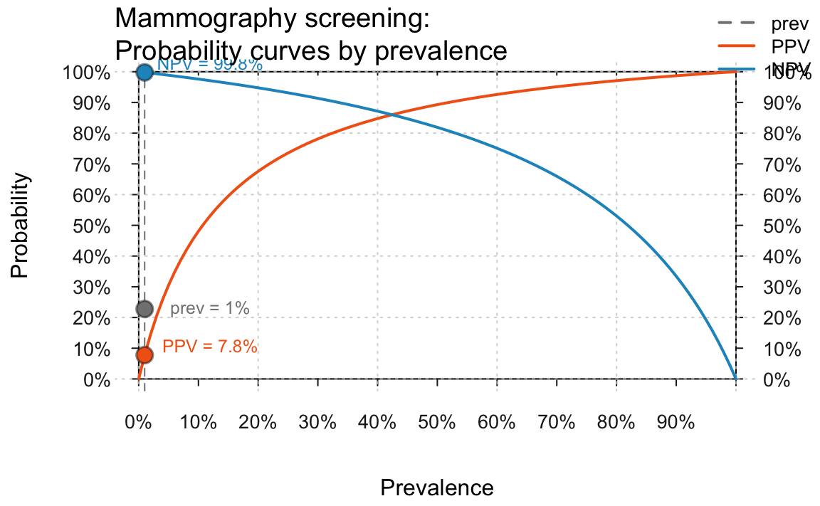
Showing PPV and NPV as a function of prevalence (for a prevalance of 1% and given values of sensitivity and specificity) in the original mammography screening scenario.
The curves illustrate that values of PPV and
NPV crucially depend on the prevalence
value prev in the current population. In fact, they
actually vary across their entire range (i.e., from 0 to 1), rendering
any communication of their value utterly meaningless without specifying
the current population’s prevalence value.
The dependency of PPV and NPV
on prev can be illustrated by assuming a higher prevalence
rate. For instance, if we knew that some woman was genetically tested
and known to exhibit the notorious BRCA1 mutation, the prevalence value
of her corresponding population (given a positive mammography result in
a routine screening) is increased to about 60% (graph not shown here to
save space, but try running the following code for yourself):
high.prev <- .60   # assume increased prevalence due to BRCA1 mutation

plot_curve(prev = high.prev, sens = .80, spec = (1 - .096),
           what = c("prev", "PPV", "NPV"),
           title_lbl = "Mammography screening (BRCA1 mutation)", cex.lbl = .80)
This shows that — given an increased prevalence value
prev of 60% — the positive predictive
value PPV of a positive test result increases from 7.8% (in
the standard population) to around 93% (given the BRCA1 mutation).
In addition, the actual values of population and test parameters are
often unclear. The plot_curve() function reflects this by
providing an uncertainty parameter uc that is expressed as
a percentage of the specified value. For instance, the following assumes
that our parameter values may deviate up to 5% from the specified values
and marks the corresponding ranges of uncertainty as shaded areas around
the curves that assume exact parameter values.
Both the notions of expressing probabilities as a function of
prevalence and of uncertainty ranges for imprecise parameter estimates
can be extended to other probabilities. The following curves show the
full set of curves currently drawn by plot_curve(). In
addition to the predictive values PPV and NPV,
we see that the bias or proportion of positive
decisions ppod and the overall accuracy acc
also vary as a function of the prevalence prev:
high.prev <- .60   # assume increased prevalence due to BRCA1 mutation

plot_curve(prev = high.prev, sens = .80, spec = (1 - .096),
           what = c("prev", "PPV", "NPV", "ppod", "acc"),
           title_lbl = "Mammography screening (BRCA1 mutation)", uc = .05, cex.lbl = .80)
#> Argument 'title_lbl' is deprecated. Please use 'main' instead.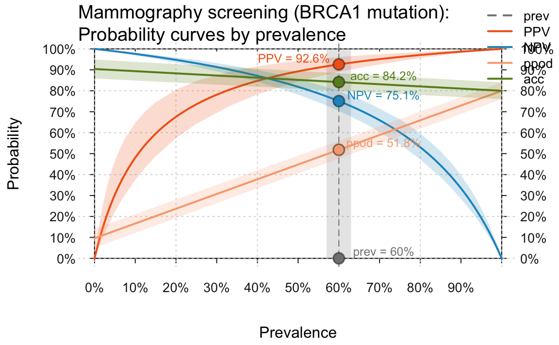
Curves that show PPV/NPV, ppod, and acc as a function of an prevalence (for given values of sensitivity and specificity) when assuming an increased prevalence of 60% and an uncertainty range of 5%.
Planes as a function of sensitivity and specificity (given a prevalence)
The plot_plane() function draws a plane for a selected
parameter as a function of sensitivity and specificity values
(with sens and spec both ranging from 0 to 1)
for a given prevalence prev:
Some examples (not shown here, but please try evaluating the following function calls):
plot_plane(prev = high.prev, sens = .80, spec = (1 - .096), what = "PPV",
           title_lbl = "A. Mammography (BRCA1)", cex.lbl = .8)
#> Argument 'title_lbl' is deprecated. Please use 'main' instead.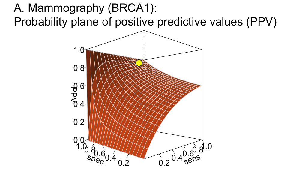
Plane showing the positive predictive value (PPV) as a function of sensitivity and specificity for a given prevalence.
Related plots (showing different probabilities) include:
plot_plane(prev = high.prev, sens = .80, spec = (1 - .096), what = "NPV",
           title_lbl = "B. Mammography (BRCA1)", cex.lbl = .8)
plot_plane(prev = high.prev, sens = .80, spec = (1 - .096), what = "ppod", what_col = "firebrick",
           title_lbl = "C. Mammography (BRCA1)", phi = 45, cex.lbl = .8)
plot_plane(prev = high.prev, sens = .80, spec = (1 - .096), what = "acc",  what_col = "forestgreen",
           title_lbl = "D. Mammography (BRCA1)", cex.lbl = .8)
Overall, viewing conditional probabilities (like PPV or
NPV, but also ppod or acc) as a
function of other probabilities (e.g., prev,
sens, spec or fart) often reveals
unexpected relationships and can enable new insights.
Resources
The following resources and versions are currently available:
| Type: | Version: | URL: |
|---|---|---|
| A. riskyr (R package): | Release version | https://CRAN.R-project.org/package=riskyr |
| Development version | https://github.com/hneth/riskyr/ | |
| B. riskyrApp (R Shiny code): | Online version | https://riskyr.org/ |
| Development version | https://github.com/hneth/riskyrApp/ | |
| C. Online documentation: | Release version | https://hneth.github.io/riskyr/ |
| Development version | https://hneth.github.io/riskyr/dev/ |
Contact
![]()
We appreciate your feedback, comments, or questions.
Please report any riskyr-related issues at https://github.com/hneth/riskyr/issues/.
Contact us at contact.riskyr@gmail.com with any comments, questions, or suggestions.
All riskyr vignettes
| Nr. | Vignette | Content |
|---|---|---|
| A. | User guide | Motivation and general instructions |
| B. | Data formats | Data formats: Frequencies and probabilities |
| C. | Confusion matrix | Confusion matrix and accuracy metrics |
| D. | Functional perspectives | Adopting functional perspectives |
| E. | Quick start primer | Quick start primer |