Visualising FFTs
Nathaniel Phillips and Hansjörg Neth
2026-05-03
Source:vignettes/FFTrees_plot.Rmd
FFTrees_plot.RmdVisualizing FFTrees
The FFTrees package makes it very easy to visualize and evaluate fast-and-frugal trees (FFTs):
Use the main
FFTrees()function to create a set of FFTs (e.g., as an R objectxof typeFFTrees).Visualize a tree in
xby evaluatingplot(x).
The two key arguments for plotting are what and
tree: Whereas the tree argument allows
selecting between different trees in x (using
tree = 1 by default), the what argument
distinguishes between five main types of plots:
plot(x, what = 'all')visualizes a tree and corresponding performance statistics. This is also the default when evaluatingplot(x).plot(x, what = 'tree')visualizes only the tree diagram of the selected tree (without performance statistics).plot(x, what = 'icontree')visualizes the tree diagram of the selected tree with icon arrays on exit nodes (with additional options forshow.iconguideandn.per.icon.plot(x, what = 'cues')visualizes the current cue accuracies in ROC space (by calling theshowcues()function).plot(x, what = 'roc')visualizes a performance comparison of FFTs and competing algorithms in ROC space.
The other arguments of the plot.FFTrees() function allow
further customization of the plot (e.g., by defining labels and
parameters, or selectively hiding or showing elements).
In the following, we illustrate both ways by creating FFTs based on
the titanic data (included in the FFTrees
package).
The Titanic data
The titanic dataset contains basic survival statistics
of Titanic passengers. For each passenger, we know in which
class s/he traveled, as well as binary categories specifying age, sex,
and survival information. To get a first impression, we inspect a random
sample of cases:
set.seed(12)  # reproducible randomness
rcases <- sort(sample(1:nrow(titanic), 10))

# Sample of data:
knitr::kable(titanic[rcases, ], caption = "A sample of 10 observations from the `titanic` data.")| class | age | sex | survived | |
|---|---|---|---|---|
| 82 | first | adult | male | FALSE |
| 91 | first | adult | male | FALSE |
| 336 | second | adult | male | TRUE |
| 346 | second | adult | male | FALSE |
| 450 | second | adult | male | FALSE |
| 546 | second | adult | female | TRUE |
| 1093 | third | adult | female | TRUE |
| 1160 | third | adult | female | FALSE |
| 1271 | third | child | male | FALSE |
| 1500 | crew | adult | male | TRUE |
Our current goal is to fit FFTs to this dataset. This essentially asks:
- Can we use the information in the cues
class,ageandsexto decide whether a passengersurvived?
First, let’s create an FFTrees object (called
titanic.fft) from the titanic dataset:
# Create FFTs for the titanic data:
titanic.fft <- FFTrees(formula = survived ~.,
                       data = titanic,
                       main = "Surviving the Titanic",
                       decision.labels = c("Died", "Survived"))
Note that we used the entire titanic data (i.e., all
2201 cases) to train titanic.fft, rather than specifying
train.p to set aside some proportion of it or specifying a
dedicated data.test set for predictive purposes. This
implies that our present goal is to fit FFTs to the historic
data, rather than on create and use FFTs to predict new
cases.
Visualising cue accuracies
We can visualize individual cue accuracies (specifically their
sensitivities and specificities) by including the
what = 'cues' argument within the plot()
function. Let’s apply the function to the titanic.fft
object to see how accurate each of the cues were on their own in
predicting survival:
plot(titanic.fft, what = "cues", main = "Cues predicting Titanic survival")#> Plotting cue training statistics:
#> — Cue accuracies ranked by bacc
#> 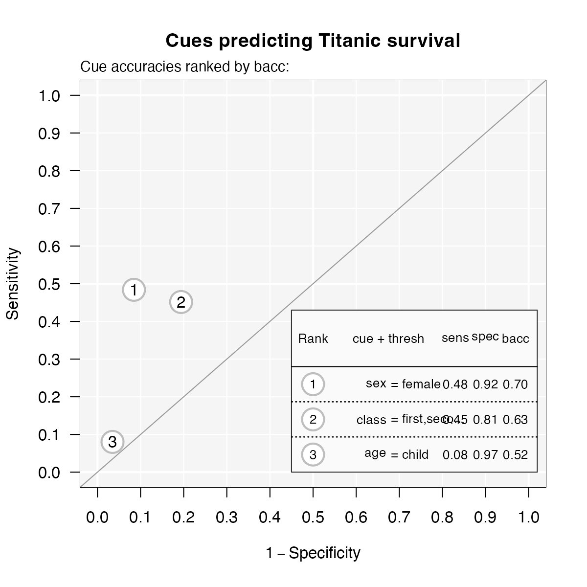
Figure 1: Cue accuracies of FFTs predicting survival in
the titanic dataset.
Given the axes of this plot, good performing cues should be near the
top left corner of the graph (i.e., exhibit both a low false alarm rate
and a high hit rate). For the titanic data, this implies
that none of the cues predicts very well on its own. The best
individual cue appears to be sex (indicated as 1), followed
by class (2). By contrast, age (3) seems a
pretty poor cue for predicting survival on its own (despite its
specificity of 97%).
Inspecting cue accuracies can provide valuable information for constructing FFTs. While they provide lower bounds on the performance of trees (as combining cues is only worthwhile when this yields a benefit), even poor individual cues can shine in combination with other predictors.
Visualizing FFTs and their performance
To visualize the tree from an FFTrees object, use
plot(). Let’s plot one of the trees (Tree #1, i.e., the
best one, given our current goal):
plot(titanic.fft, tree = 1)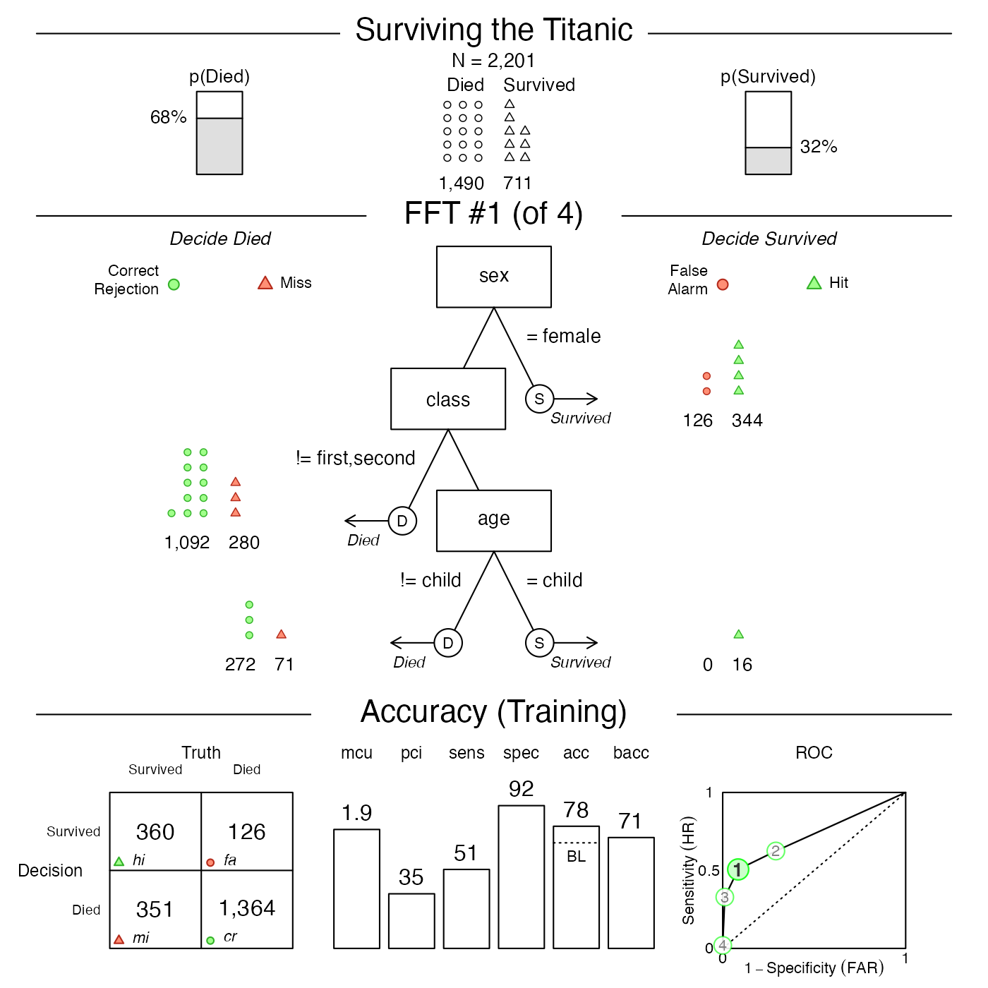
Figure 2: Plotting the best FFT of an
FFTrees object.
The resulting plot visualizes one out of
rtitanic.fftn\ possible trees in thetitanic.fftobject. Astree
=
1corresponds to the best tree given our currentgoalfor selecting FFTs, we could have plotted the same tree by specifyingtree
= ‘best.train’`.
As Figure 2 contains a lot of information in three distinct panels, let’s briefly consider their contents:
Basic dataset information: The top row of the plot shows basic information on the current dataset: Its population size (N) and the baseline frequencies of the two categories of the criterion variable.
-
FFT and classification performance: The middle row shows the tree (in the center) as well as how many cases (here: persons) were classified at each level in the tree (on either side). For example, the current tree (Tree #1 of 4) can be understood as:
- If a person is female, decide that they survived.
- Otherwise, if a person is neither in first nor in second class, decide that they died.
- Finally, if the person is a child, predict they survived, otherwise decide that they died.
Accuracy and performance information: The bottom row shows general performance statistics of the FFT:
As our models intitanic.fftwere trained on the entiretitanicdataset, we fitted FFTs to its 2201 cases, rather than setting aside some data for predictive purposes. The panel label reflects this important distinction:
If the results of fitting data (i.e., data used to build the tree) are displayed, we’ll see a “Training” label.
If a testing dataset separate from the one used to build the tree is used, we’ll see a “Prediction” label.
The bottom panel provides performance information and is structured into three subpanels:
The classification table (on the left) shows the relationship between the true criterion states (as columns) and predicted decisions (as rows). The abbreviations hi (hits) and cr (Correct rejections) denote correct decisions; mi (misses) and fa (false-alarms) denote incorrect decisions.
A range of vertical levels (in the middle) show the tree’s cumulative performance in terms of two frugality measures (
mcuandpci) and various accuracy measures (sensitivity, specificity, accuracy, and balanced accuracy (see Accuracy statistics for details).Finally, the plot (on the right) shows an ROC curve comparing the performance of all trees in the
FFTreesobject. Additionally, the performance of logistic regression (blue) and CART (red) are shown. The tree plotted in the middle panel is highlighted in a solid green color (i.e., Figure 2 shows Tree #1).
Additional arguments
Specifying additional arguments of plot() changes what
and how various elements are being displayed.
-
whatshould be visualized? Thewhatargument selects contents to be plotted:When
what = 'all'(as by default), the plot shows both a tree diagram and a range of corresponding performance statistics. Using one of the otherwhatoptions narrows the range of what is being shown:To only visualize a bare tree diagram (without performance statistics), we specify
what = "tree"(formerlystats = FALSE).To visualize the tree diagram with icon arrays on exit nodes, we specify
what = "icontree"(with additional options forshow.iconguideandn.per.icon).To visualize the performance comparison (for different FFTs and competing algorithms) in ROC space, we specify
what = "roc".
The following examples illustrate the wide range of corresponding plots:
# Plot tree diagram with icon arrays:
plot(titanic.fft, what = "icontree",
     n.per.icon = 50, show.iconguide = TRUE)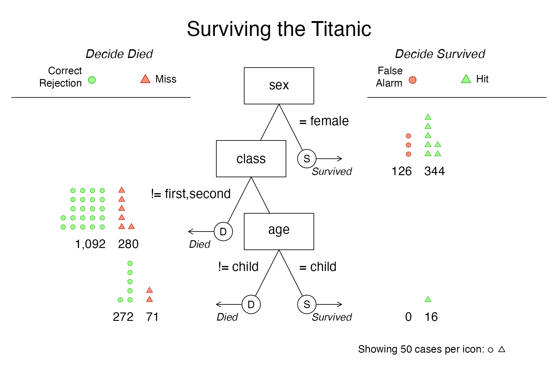
Figure 3: An FFT diagram with icon arrays on exit nodes.
# Plot only the performance comparison in ROC space:
plot(titanic.fft, what = "roc")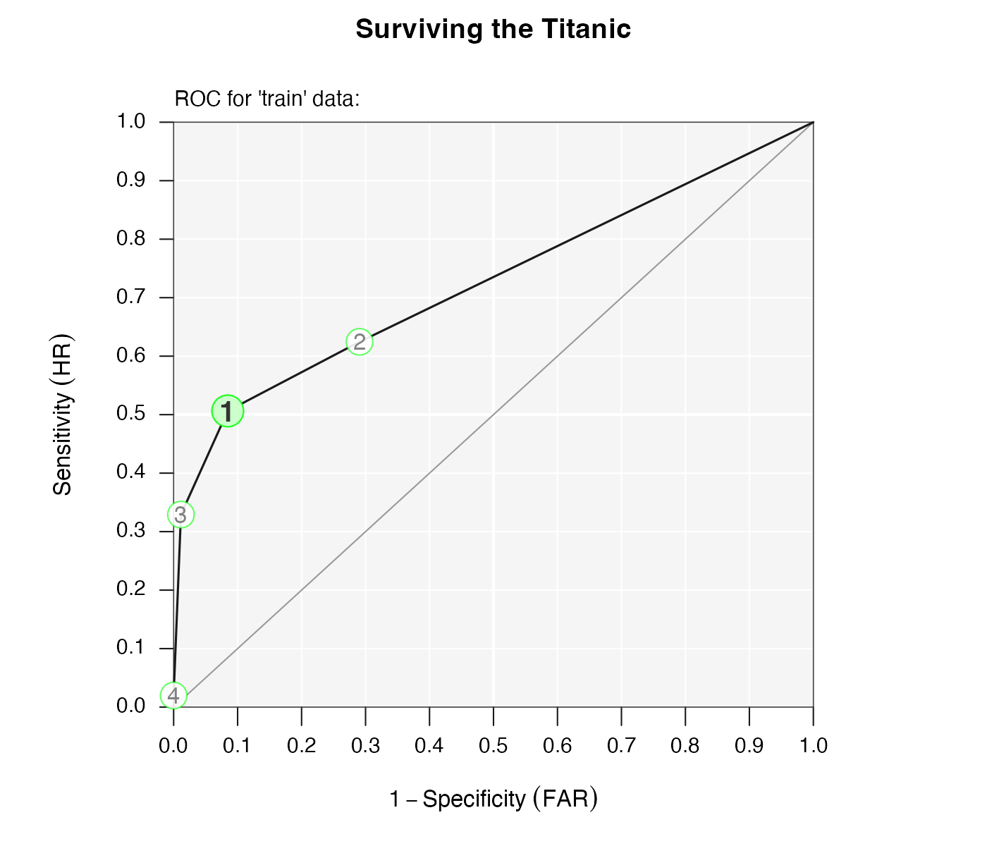
Figure 4: Performance comparison of FFTs in ROC space.
- When the main options for
whatdo not suffice, variousshow.arguments (i.e.,show.header,show.tree,show.confusion,show.levels,show.roc,show.icons, andshow.iconguide) allow to selectively turn on or turn off specific elements of the overall plot. For example:
# Hide some elements of the FFT plot:
plot(titanic.fft,
     show.icons = FALSE,     # hide icons
     show.iconguide = FALSE, # hide icon guide
     show.header = FALSE     # hide header
     )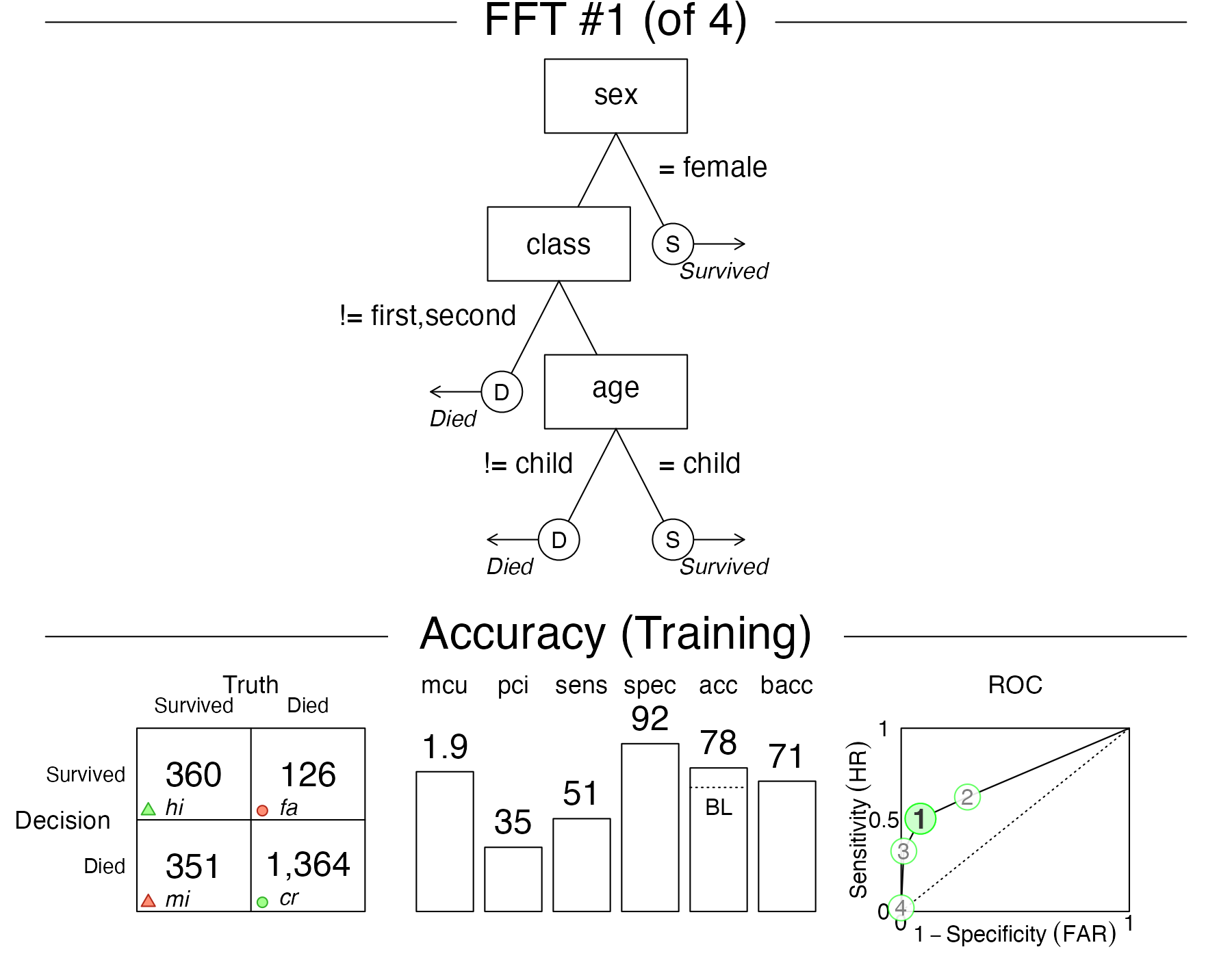
Figure 5: Plotting selected elements.
tree: Which tree do we want to plot? AsFFTreesobjects typically contain multiple FFTs, we need to indicate which tree we want to visualize. We usually specify the tree to show by an integer value, such astree = 2, which will plot the corresponding tree (i.e., Tree #2) of theFFTreesobject. Alternatively, we can specifytree = "best.train"ortree = "best.test"to visualize the best training or prediction tree, respectively. This selects and shows the tree with the highest goal value (e.g., weighted accuracywacc) when fitting or testing data.data: Which data do we want to apply the tree to? We can specifydata = "train"ordata = "test"to distinguish between a training and testing dataset (if available) in theFFTreesobject. As not allFFTreesobjects contain test data,datais set todata = "train"by default.
As the data and tree arguments can both
refer to datasets used for training or fitting (i.e., the “train” or
“test” sets), they should be specified consistently. For instance, the
following command would visualize the best training tree in
titanic.fft:
plot(titanic.fft, tree = "best.train")as data = "train" by default. However, the following
analog expression would fail:
plot(titanic.fft, tree = "best.test")for two distinct reasons:
When
dataremains unspecified, its default isdata = "train". Thus, asking fortree = "best.test"would require switching todata = "test".More crucially,
titanic.fftwas created without any test data. Hence, asking for the best test tree does not make sense — which is whyplot()will show the best training tree (with a warning).
Plotting performance for new data
Shifting our emphasis from fitting to prediction, we primarily need
to specify some test data that was not used to train the
FFTrees object.
When predicting performance for a new dataset (e.g.;
data = test.data), the plotting and printing functions will
automatically apply an existing FFTrees object to the new
data and compute corresponding performance statistics (using the
fftrees_apply() function). However, when applying existing
FFTs to new data, the changes to the FFTrees object are not
stored in the input object, unless the (invisible) output of
plot.FFTrees() or print.FFTrees() is
re-assigned to that object. The best way to fit FFTs to training data
and evaluate them to test data is to explicitly include both datasets in
the original FFTrees() command by either using its
data.test or its train.p argument.
For example, we can repeat the previous analysis, but now let’s
create separate training and test datasets by including the
train.p = .50 argument. This will split the dataset into a
50% training set, and a distinct 50% testing set. (Alternatively, we
could specify a dedicated test data set by using the
data.test argument.)
set.seed(100)  # for replicability of the training/test split
titanic.pred.fft <- FFTrees(formula = survived ~.,
                            data = titanic,
                            train.p = .50,  # use 50% to train, 50% to test
                            main = "Titanic",
                            decision.labels = c("Died", "Survived")
                            )
Here is the best training tree applied to the training data:
# print(titanic.pred.fft, tree = 1)
plot(titanic.pred.fft, tree = 1)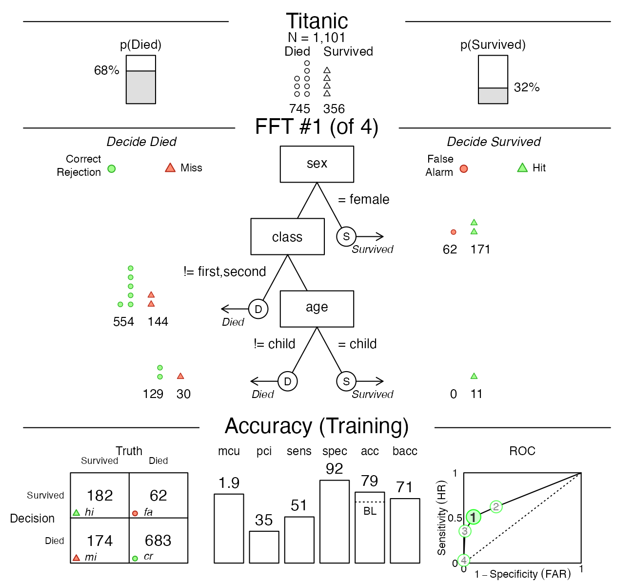
Figure 6: Plotting the best FFT on training data.
Tree #1 is the best training tree — and could also be visualized by
plot(titanic.pred.fft, tree = "best.train"). This tree has
a high specificity of 92%, but a much lower sensitivity of just 51%. The
overall accuracy of the tree’s classifications is at 79%, which exceeds
the baseline, but is far from perfect. However, as we can see in the
ROC table, a logistic regression (LR) would not perform much better, and
CART performed even worse than Tree #1.
Now let’s inspect the performance of the same tree on the test data:
# print(titanic.pred.fft, data = "test", tree = 1)
plot(titanic.pred.fft, data = "test", tree = 1)
Figure 7: Plotting the best FFT on test data.
We could have visualized the same tree by asking for
plot(titanic.pred.fft, data = "test", tree = "best.test").
Note that the label of the bottom panel has now switched from “Accuracy
(Training)” to “Accuracy (Testing)”. Both the sensitivity and
specificity values have decreased somewhat, which is typical when using
a model (fitted on training data) for predicting new (test) data.
Let’s visualize the prediction performance of Tree #2, the most liberal tree (i.e., with the highest sensitivity):
plot(titanic.pred.fft, data = "test", tree = 2)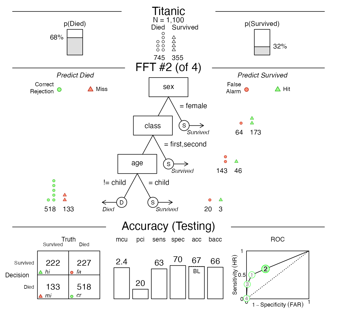
Figure 8: Plotting Tree #2.
This alternative tree has a better sensitivity (of 63%), but its overall accuracy decreased to about baseline level (of 67%).
Whereas comparing training with test performance illustrates the trade-offs between mere fitting and genuine predictive modeling, comparing the performance details of various FFTs illustrates the typical trade-offs that any model for solving binary classification problems engages in. Importantly, both types of trade-offs are rendered transparent when using FFTrees.
Vignettes
Here is a complete list of the vignettes available in the FFTrees package:
| Vignette | Description | |
|---|---|---|
| Main guide: FFTrees overview | An overview of the FFTrees package | |
| 1 | Tutorial: FFTs for heart disease | An example of using FFTrees() to model
heart disease diagnosis |
| 2 | Accuracy statistics | Definitions of accuracy statistics used throughout the package |
| 3 | Creating FFTs with FFTrees() | Details on the main FFTrees()
function |
| 4 | Manually specifying FFTs | How to directly create FFTs without using the built-in algorithms |
| 5 | Visualizing FFTs | Plotting FFTrees objects, from full trees
to icon arrays |
| 6 | Examples of FFTs | Examples of FFTs from different datasets contained in the package |